Usage Guide
Get Started
Thanks for using our theme!
To set up the theme exactly like our demo stores, you may need to install the our free app PapaThemes Widgets. This app provides additional widgets to build the content in Page Builder visually without coding skill.
For displaying your Instagram photos on your website, you can use our free tool PapaThemes Instagram. We will guide you step by step later in this manual.
Customzing Typography, Fonts and Colors
Customzing Typography, Fonts and Colors, Buttons in Page Builder > Theme Styles > General. There are dozens of options to help you customize your website beautifully and uniquely.
Customzing Checkout Page's Typography and Colors
Customzing the checkout page's typography and colors in Page Builder > Theme Styles > Optimized Checkout
Installing PapaThemes Widgets App
Find and install PapaThemes Widgets app from BigCommerce Apps Marketplace.
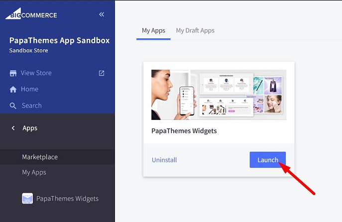
After installed, go to your admin page, on the left sidebar, click Apps > My Apps, click Launch button of PapaThemes Widgets app to open the app:
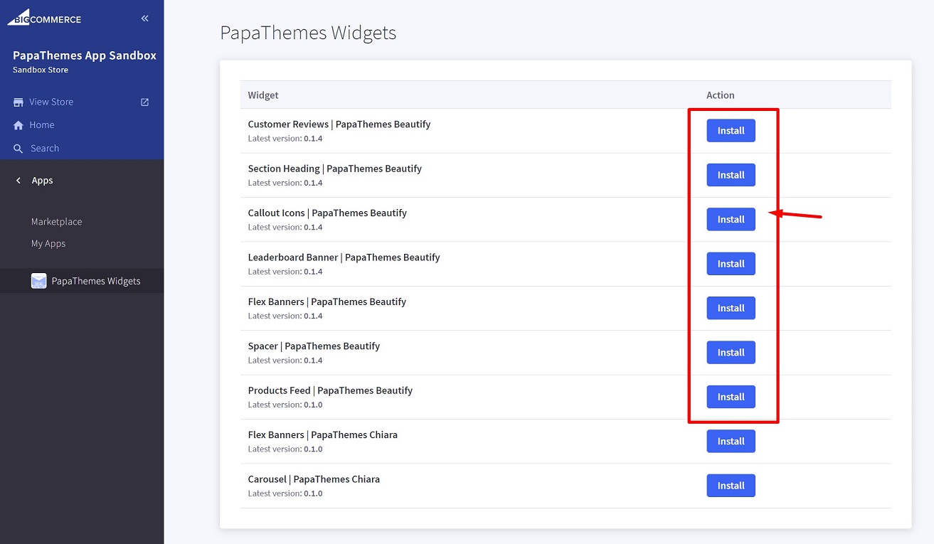
Then click the Install buttons in turn to install all widgets for Beautify theme:
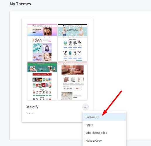
Go to Storefront > My Themes > click Customize in dropdown menu of Beautify theme to open Page Builder. Select any theme style to start:
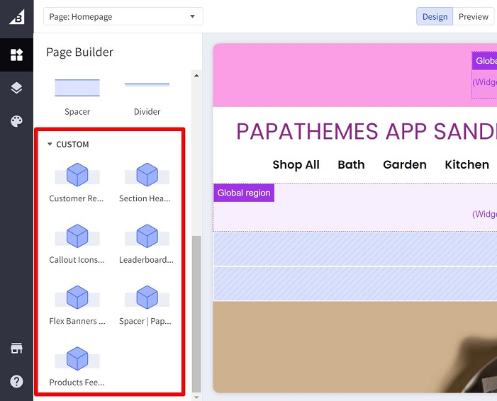
Verify the widgets installed successfully if they appear in Page Builder:
Setting Up Cosmetics Home Page
In your admin page, go to Storefront > My Themes, click Customize in the dropdown menu of Beautify theme, select Cosmetics style, then click Continue button to open Page Builder.
Top Banner

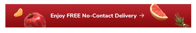
To create the top banner, go to Marketing > Banners > click Create a Banner button.
Enter Banner Name, Banner Content. Select Show on Page = Home Page. Select Location = Top of Page. Then click Save button to finish.
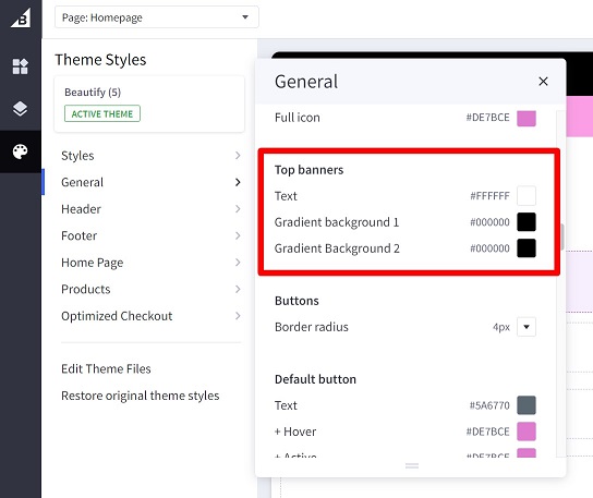
Configuring the top banner colors in Page Builder > Theme Styles > General > Top Banners:
Header
Editing the phone number in Store Setup > Store Profile > Phone.
Editing the currencies list in Store Setup > Currencies.
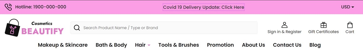
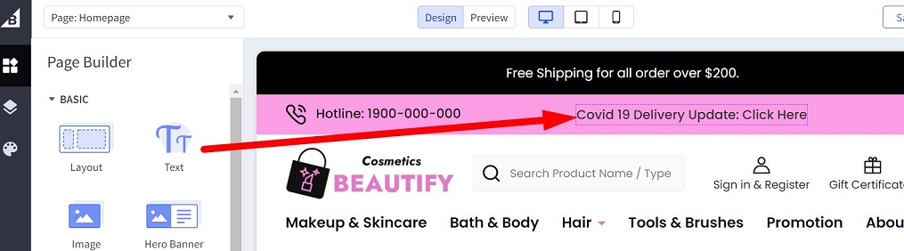
The announcement (ie: Covid 19 Delivery Update: Click Here) displays on all pages. Drag the Text widget to this region to add it:
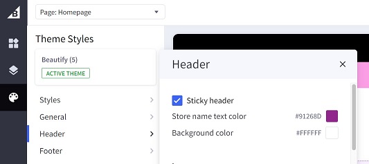
Changing the header's background color, the site name's text color, toggle auto hide/show header in Page Builder > Theme Styles > Header as showed in the screenshot below:
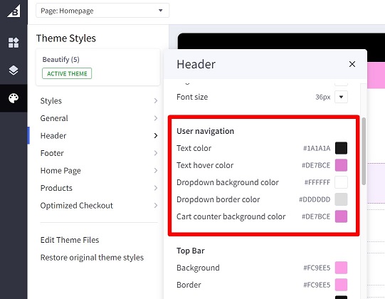
Changing the icons and links's colors (ie. Sign in & Register, Gift Certificates, Cart) in Theme Styles > Headers > User navigation:
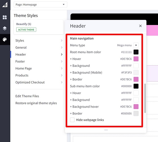
Changing the main navigation's colors in Theme Styles > Header > Main navigation:
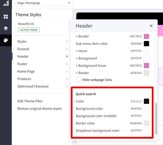
Changing the quick search form in Theme Styles > Header > Quick search:
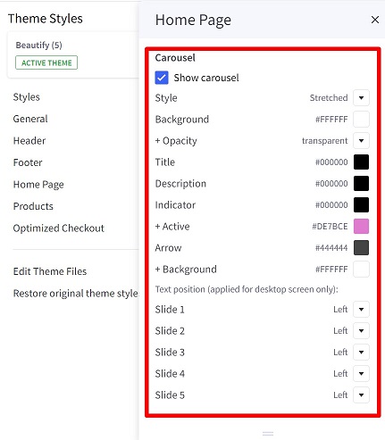
Home Page Carousel
Creating the home page carousel in Storefront > Home Page Carousel.
You can:
- Turn off / on the home page carousel.
- Change colors.
- Change the content position of each slide.
Go to Page Builder > Theme Styles > Home Page > Carousel:
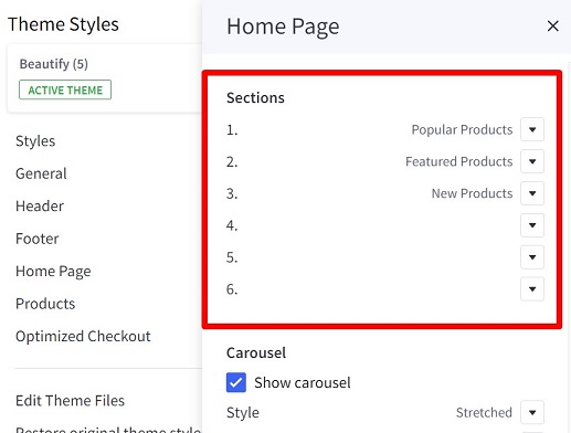
Content Arrangement
You can arrange the content of the home page in Page Builder > Theme Styles > Home Pages > Sections, choose the content to display on each position.
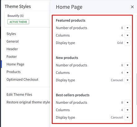
New / Featured / Popular Products
You can configure number of products to display, number of products per row, display type (grid or carousel) in Page Builder > Theme Styles > Home Page > Featured products or New products or Best-sellers products:
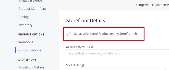
To set product as Featured, edit the product, select Set as a Featured Product on my Storefront as the screenshot below:
Popular products are automatically assigned by BigCommerce based on customer order analysis.
New products are automatically assigned by BigCommerce based on the product's added date.
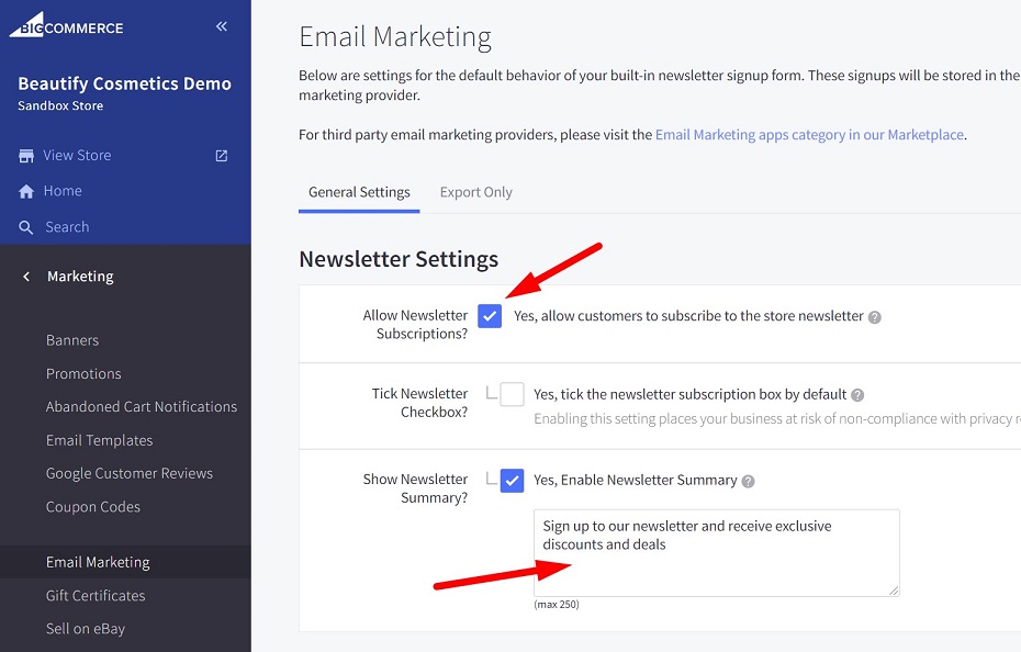
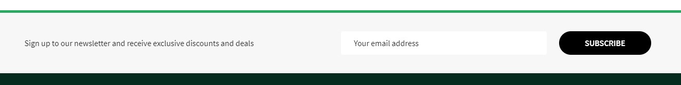
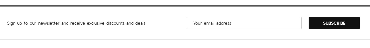
Newsletter Subscription Form
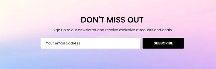
Enabling the newsletter subscription feature in Marketing > Email Marketing, tick on Allow Newsletter Subscriptions, enter the summary content in Show Newsletter Summary box if you want. See below screenshot for example:
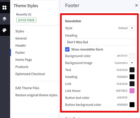
You can configure the heading, display style, colors, background image and toggle this newsletter form on the footer in Page Builder > Theme Styles > Footer > Newsletter:
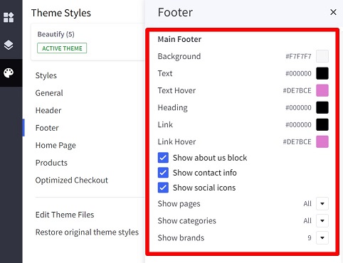
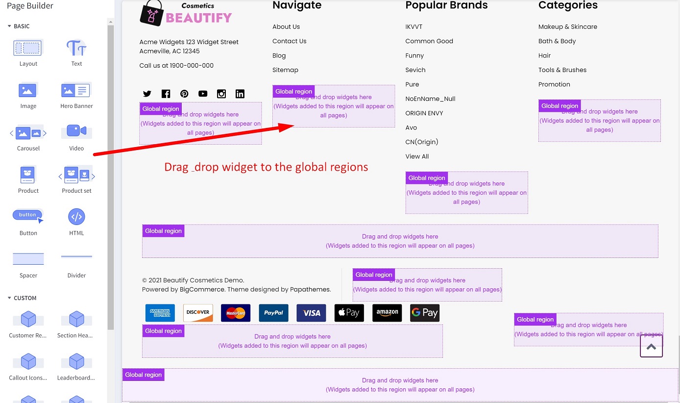
Footer
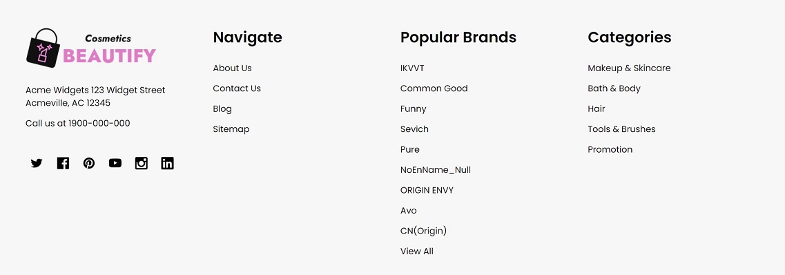
Configuring the footer in Page Builder > Theme Styles > Footer > Main Footer:
Configuring the social icons in Storefront > Social Media Links.
You can also add the custom cotent to the footer using widgets. Just drag the widget to the available regions:
Copyright
Configuring the copyright's colors in Page Builder > Theme Styles > Footer > Copyright:
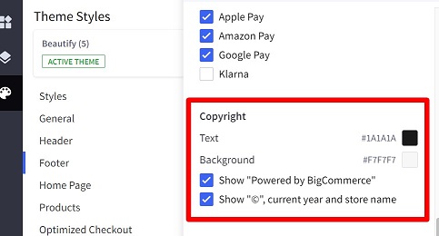
You can also toggle "Powered by BigCommerce" and "© current year and store name".
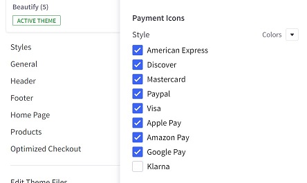
Payment Icons & GeoTrust SSL Seal
Configuring the payment icons in Page Builder > Theme Styles > Footer > Payment icons:
Configuring GeoTrust SSL seal in Page Builder > Theme Styles > Footer > GeoTrust SSL:
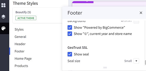
Note that GeoTrust SSL seal only displays if you purchase GeoTrust SSL Certificate from BigCommerce. Read more details here.
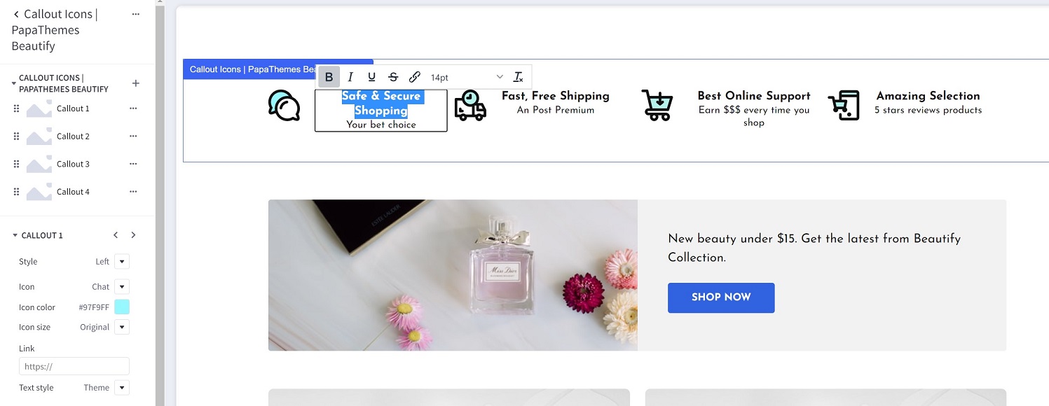
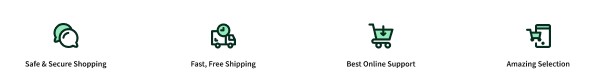
Callout Icons
To display these icons, drag and drop Callout Icons | PapaThemes Beautify widget to the particular region:
For Cosmetics style choose Style = Large, Icon color = #ecb9e4, Icon size = Original, Text style = Theme.
Select an icon in Icon list. You can also input your custom icon if selecting Icon = Custom then in put the SVG file content to the next text box. Or if selecting Icon = Choose Image, you can upload your image file.
Enter the link in Link text box.
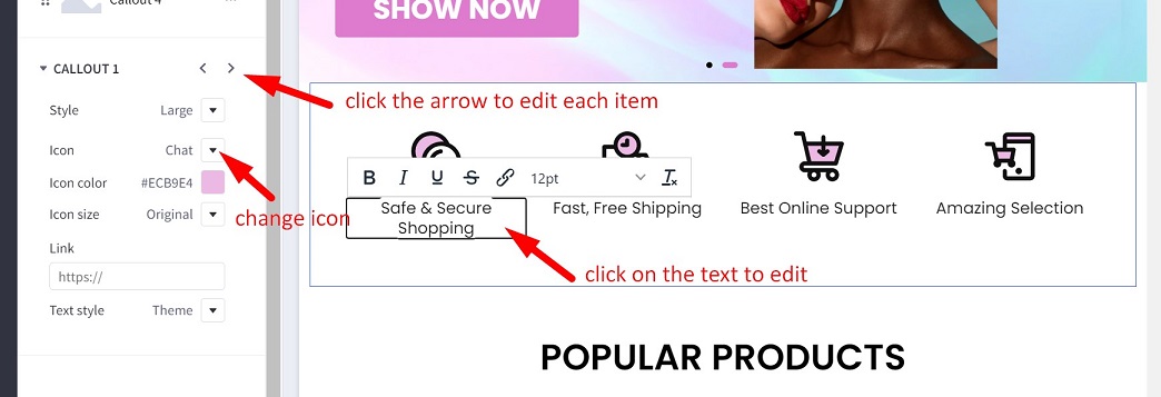
Click Save button to save your changes.
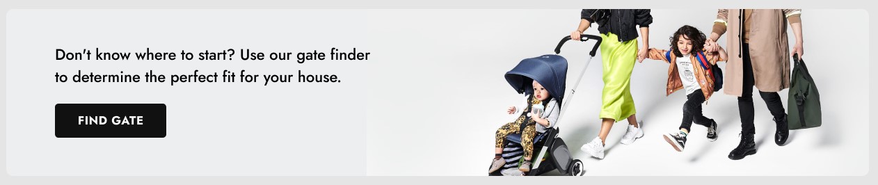
Leaderboard Banner
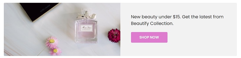
Drag & drop Leaderboard Banner | PapaThemes Beautify widget to a particular region.
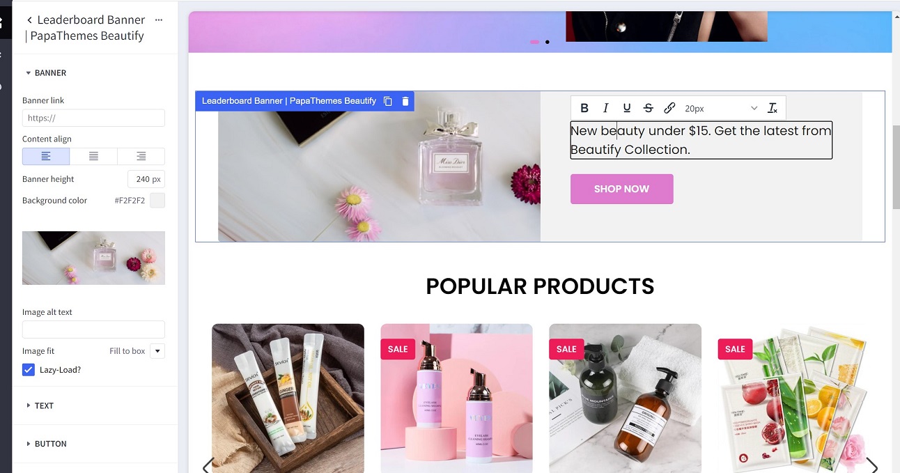
Click on the text or button to edit its content.
Widget Settings:
Banners:
- Banner link: Enter the banner link.
- Content align: setting content aligment left, center or right.
- Banner height: Specify the image height.
- Background color: Input the background color.
- Image: Upload your image.
- Image alt text: Image altenative text.
- Image fit: Display image fit to the box or cover the box.
- Lazy-load?: Use lazy-load image.
Text:
- Description style: Text style, set
Themeto use the theme style. - Text color: Text color on desktop.
- Text color (mobile): Text color on mobile.
Button:
- Button: Show or hide the button.
- Button style: set
Theme defaultto use the theme style.
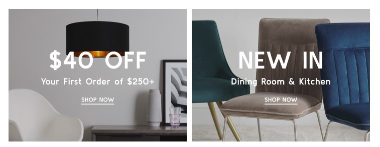
Flex Banners
Drag & drop Flex Banners | PapaThemes Beautify widget to a particular region.
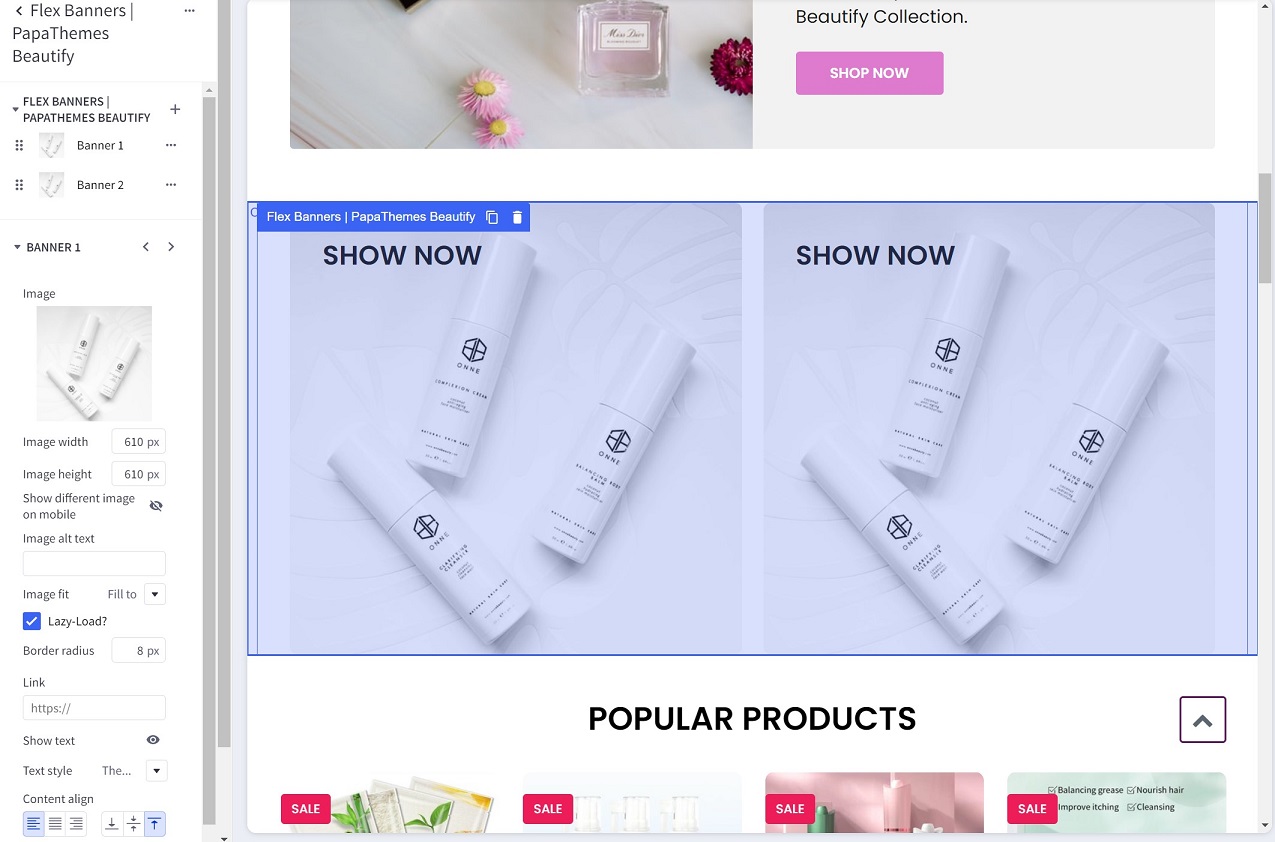
Click on the text or button to edit its content.
Widget Settings:
- Image: Upload your image.
- Image width: Specify the image width.
- Image height: Specify the image height.
- Show different image on mobile: Allows displaying a different image on mobile.
- Image alt text: Image alternative text.
- Image fit: Display image fit to the box or cover the box.
- Lazy-load?: Use lazy-load image.
- Link: Enter the banner link.
- Show text: Toggle text visibility.
- Text style: specify text style using the theme style or custom.
- Content align: align content left, right or center, top, bottom or middle.
- Content padding: Spacing around the text.
- Action button: Toggle the button visibility.
- Style for theme: pre-styled for some particular theme.
- Your theme name: Enter your theme name to allow you to customize its style using CSS.
Spacer Widget
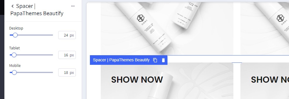
Spacer | PapaThemes Beautify widget allows adding spacing between widgets. It also supports different spacing on desktop, tablet and mobile.
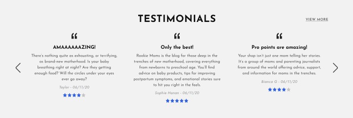
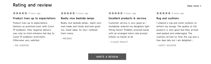
Customer Reviews Slider (or Testimonials)
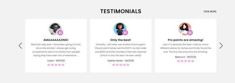
Drag & drop Customer Reviews | PapaThemes Beautify widget to a particular region.
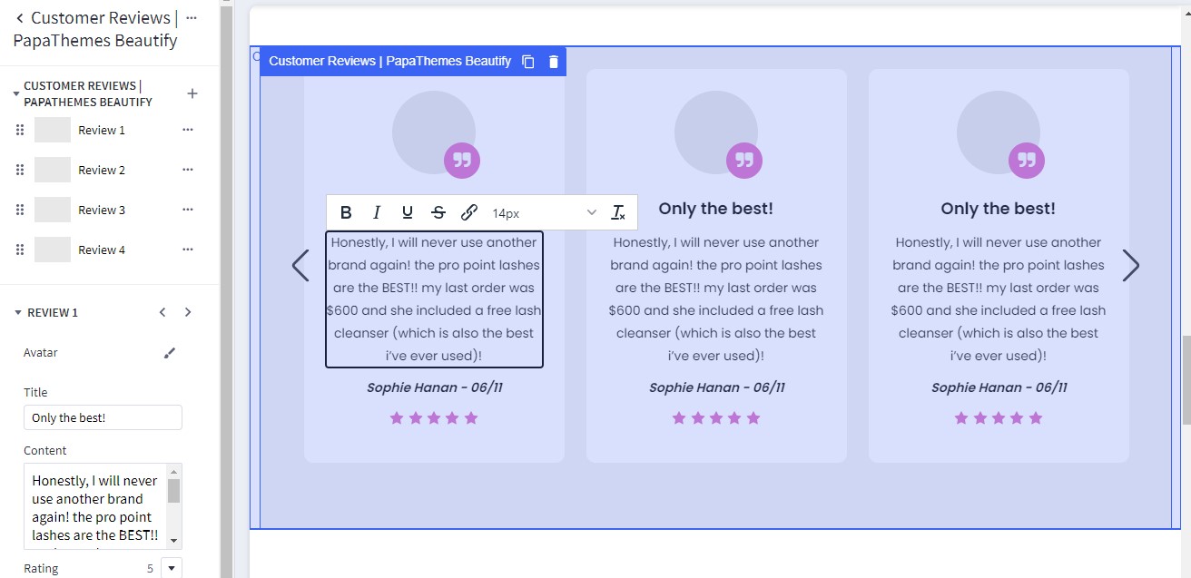
Click on the text or button to edit its content.
Widget Settings:
- Avatar: Choose avatar image or avatar color.
- Title: The review title.
- Content: The review content.
- Rating: The rating stars.
- Author: Reviewer name.
- Style for theme: pre-styled for some particular theme.
- Your theme name: Enter your theme name to allow you to customize its style using CSS.
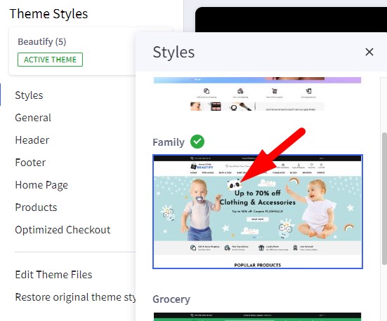
Setting Up Family Home Page
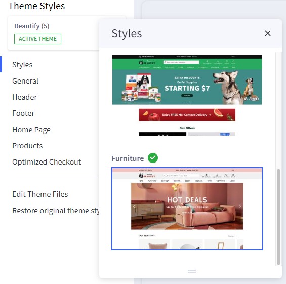
In Page Builder > Theme Styles, if your current style is not Family, click on Family thumbnail to apply:
General
These features are same as Cosmetics style:
- Top Banner
- Header
- Home Page Carousel
- Content Arrangement
- New / Featured / Popular Products
- Newsletter Subscription Form
- Footer
- Copyright
- Payment Icons & GeoTrust SSL Seal
- Leaderboard Banner
- Flex Banners
- Spacer Widget
- Customer Reviews Slider (or Testimonials)
Callout Icons
Follow Callout Icons instruction in Cosmetics style to add the widget.
Set Style = Left and Icon color = #97F9FF for each callout icon. You can use the inline text editor to format the text font size and weight as you want.
Flex Banners
Follow Flex Banners instruction in Cosmetics style to add the widget.
Customer Reviews Slider (or Testimonials)
Follow Customer Reviews Slider (or Testimonials) instruction in Cosmetics style to add the widget.
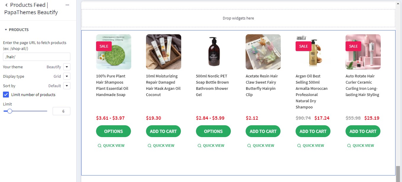
In Page Builder > Theme Styles > Home Page > Third-party widgets, choose Columns in Products Feed widget
= 4.
Brands Logo
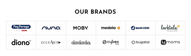
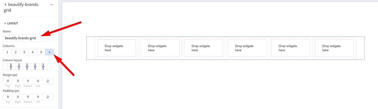
Drag & drop Layout widget to a particular region. Set Columns = 6. Enter Name = beautify-brands-grid to appear as below screenshot:
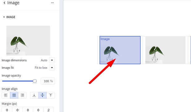
Set Image width = 400, Image height = 530.
Drag & drop Image widget to all columns:
Repeat the above steps create another row.
The result looks like this screenshot:
Leaderboard Banner
Follow Leaderboard Banner instruction in Cosmetics style to add the widget.
Choose Content align = Right.
Instagram Photos
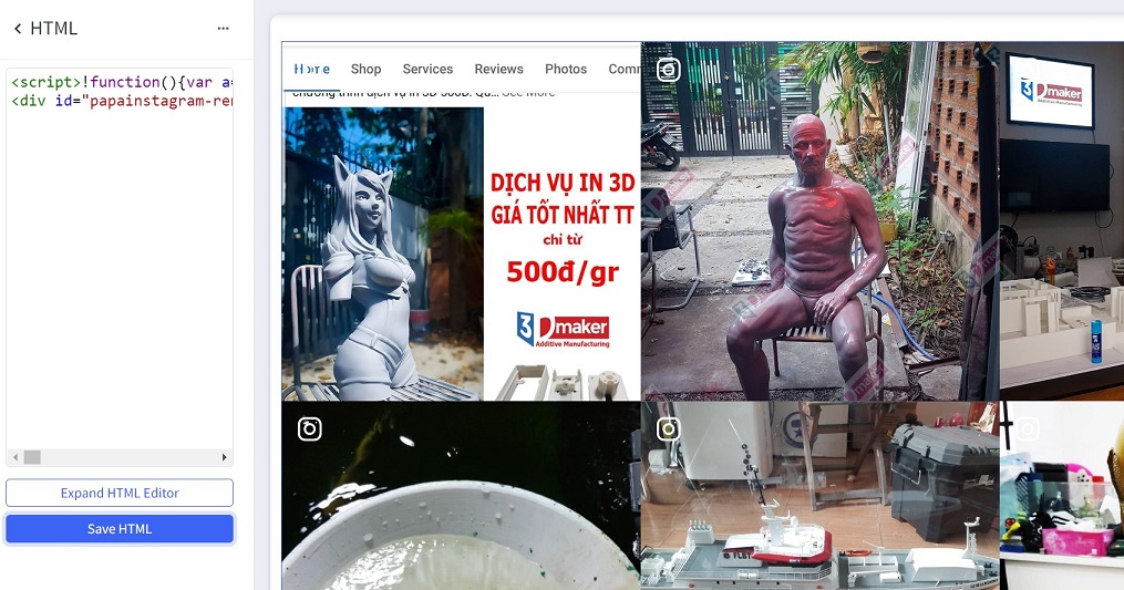
To display your Instagram photos, use our Instagram App, follow the instruction on that page to generate the code. Copy all the code in step 1 and step 2:
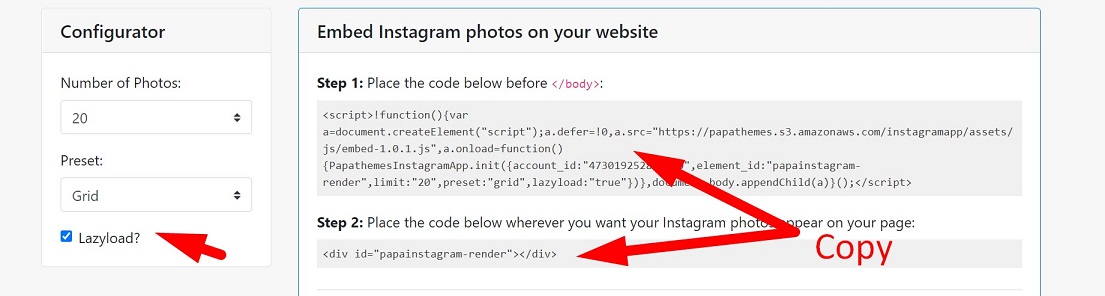
Drag & drop HTML widget to a particular region, paste the code to the HTML editor:
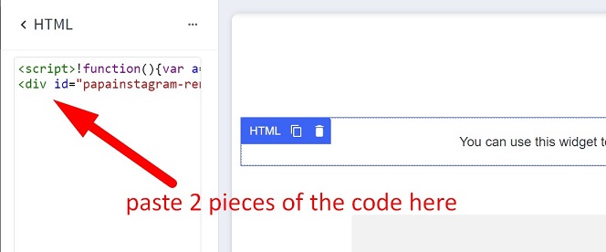
Click Save HTML button, you could see the result looks like this:
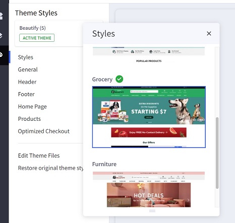
Setting Up Grocery Home Page
In Page Builder > Theme Styles, if your current style is not Grocery, click on Grocery thumbnail to apply:
General
These features are same as Cosmetics style:
- Top Banner
- Header
- Home Page Carousel
- Content Arrangement
- New / Featured / Popular Products
- Newsletter Subscription Form
- Footer
- Copyright
- Payment Icons & GeoTrust SSL Seal
- Leaderboard Banner
- Flex Banners
- Spacer Widget
- Customer Reviews Slider (or Testimonials)
Leaderboard Banner
Follow Leaderboard Banner instruction in Cosmetics style to add the widget.
Flex Banners
Follow Flex Banners instruction in Cosmetics style to add the widget.
For each banner, choose Style for theme = Beautify Grocery, enable Action button to display the Shop Now button.
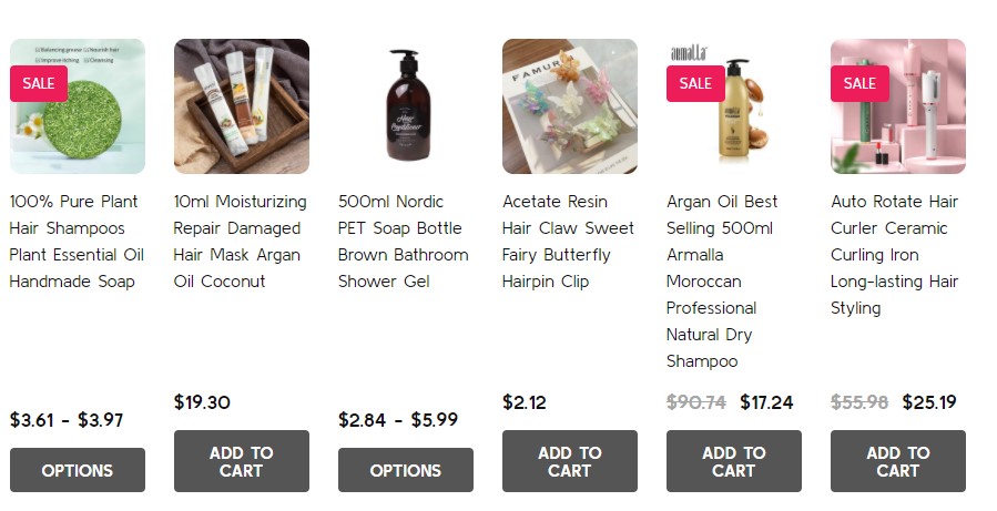
Products Feed
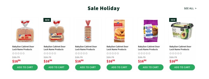
To display products feed from a particular category, create a category (ie. Sale Holiday), then add products to this category.
Drag & drop Products Feed | PapaThemes Beautify widget to a particular region.
- Enter the category URL, for example
/sale-holiday/. - Choose Your theme =
Beautify. - Limit number of products =
6.
Configuring number of products row in Page Builder > Theme Styles > Home Page > Third-party widgets > set the value of Columns in Products Feeds widgets.
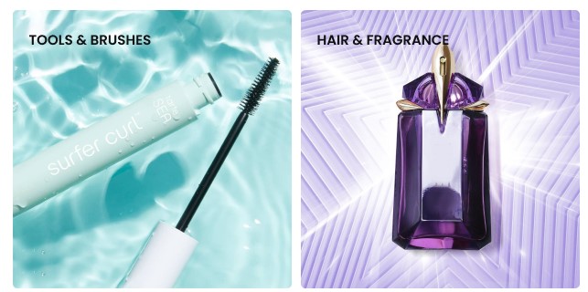
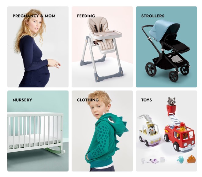
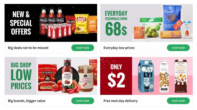
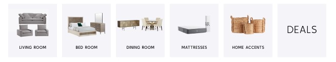
Category Banners
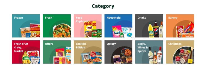
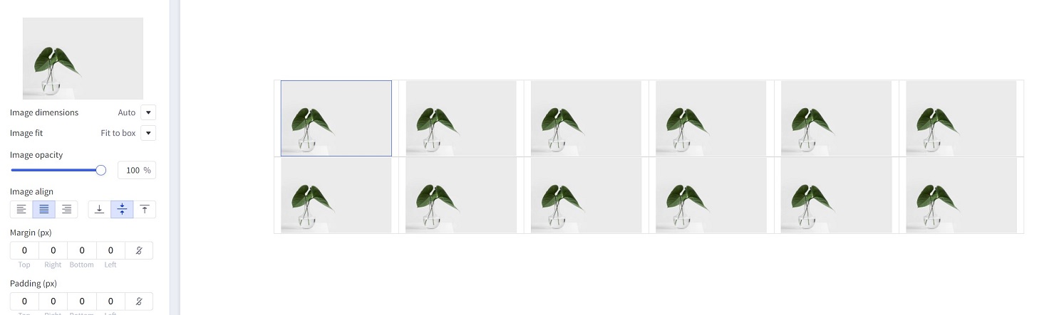
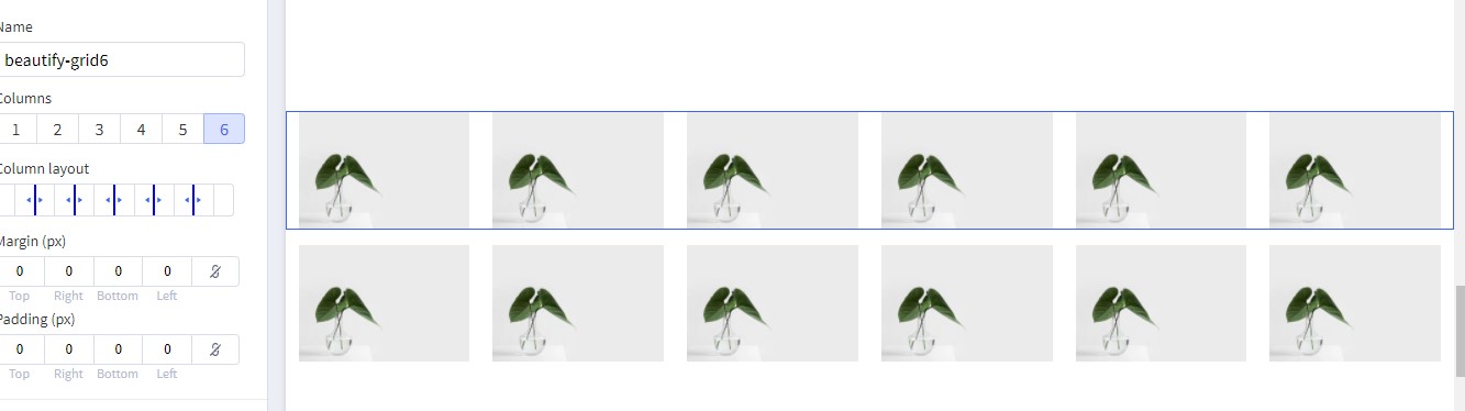
Drag & drop Layout widget to a particular region. Set Columns = 6. Enter Name = beautify-grid6 to appear as below screenshot:
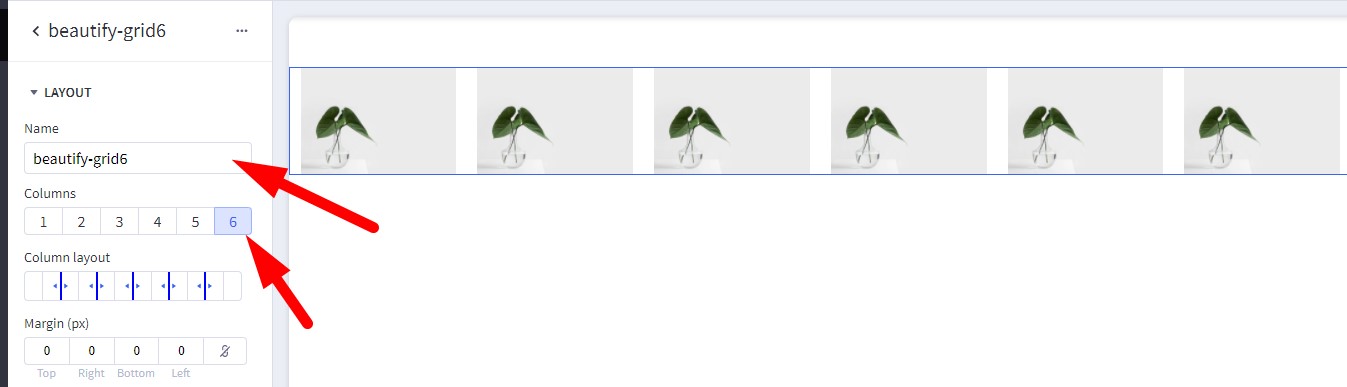
Set Image width = 400, Image height = 530.
Drag & drop Image widget to all columns:
Repeat the above steps create another row. Add some spacing using Spacer widget.
The result looks like this screenshot:
Customer Reviews Slider (or Testimonials)

Follow Customer Reviews Slider (or Testimonials) instruction in Cosmetics style to add the widget.
For each review, set Style for theme = Beautify Grocery.
In Page Builder > Theme Styles > Home Page > Third-pary widgets > Set Customer reviews per slide = 1.
Recent Blog
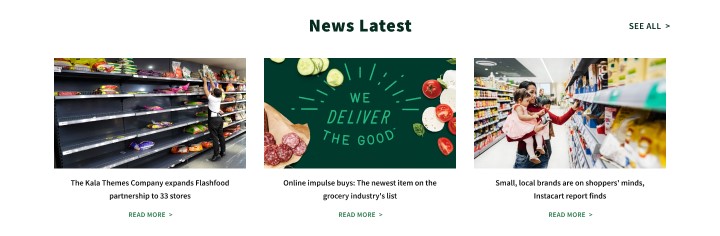
Configuring the recent blog on home page in Page Builder > Theme Styles > Home Page > Recent Blog:
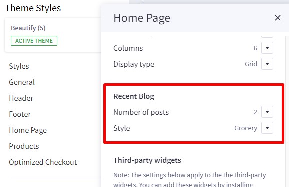
You can configure Number of posts to display, and display style.
Callout Icons
Follow Callout Icons instruction in Cosmetics style to add the widget.
Set Icon color = #94E9B9 for each callout icon.
Newsletter Subscription Form
Follow Newsletter Subscription Form instruction in Cosmetics style configure this form.
In Page Builder > Theme Styles > Footer > Newsletter > set Style = Grocery.
Setting Up Furniture Home Page
In Page Builder > Theme Styles, if your current style is not Furniture, click on Furniture thumbnail to apply:
General
These features are same as Cosmetics style:
- Top Banner
- Header
- Home Page Carousel
- Content Arrangement
- New / Featured / Popular Products
- Newsletter Subscription Form
- Footer
- Copyright
- Payment Icons & GeoTrust SSL Seal
- Leaderboard Banner
- Flex Banners
- Spacer Widget
- Customer Reviews Slider (or Testimonials)
Category Banners
Follow Category Banners instruction in Grocery style to add this category banners
Leaderboard Banner
Please follow Leaderboard Banner instruction in Cosmetics style to display this banner.
Instagram Photos
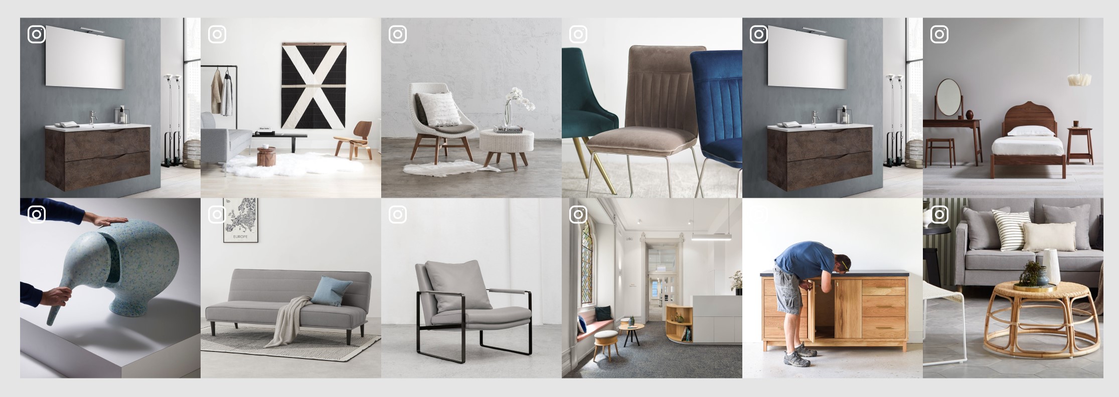
Please follow Instagram Photos instruction in Family style to display Instagram photos.
Customer Reviews
Follow Customer Reviews Slider (or Testimonials) instruction in Cosmetics style to add the widget.
In each review item, select Style for theme = Beautify Furniture.
Flex Banners
Pleae follow Flex Banners instruction in Cosmetics style to display these hero banners.
In each banner, enable Show heading, Show description and Action button. Click on the brush icon next to Action button to open Action button setting panel, choose Style = underline.
Newsletter Subscription Form
Follow Newsletter Subscription Form instruction in Cosmetics style configure this form.
In Page Builder > Theme Styles > Footer > Newsletter > set Style = Grocery.
Customizing Products Display
Product Card
Configuring product cards in Page Builder > Theme Styles > Products > Product cards.
- Alignment: Specifying content alignment
leftorcenter. - Product title color: Specifying the product name's color.
-
- Hover: Specifying color when hover or focus.
- Button text color: Specifying the button text color.
-
- Background: Specifying the button background color.
-
- Border: Specifying the button border color.
- Show second image on hover: Displaying the second image when hover the product card.
Displaying product price ranges
By default product price ranges is enabled. To turn off, Go to Page Builder > Theme Styles > Products > uncheck Price ranges checkbox.
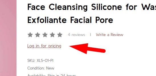
Hiding prices for non logged in customers
To turn on this feature, go to Page Builder > Theme Styles > Products > tick Restrict Purchase to Login checkbox.
Redirecting to cart page after product added to cart
By default the cart popup is displayed, if you want to take customer to the cart page instead, go to Page Builder > Theme Styles > Products > tick Redirect to cart page after add to cart checkbox.
Showing/Hiding Quick-View button
By default quick-view buttons appear on all product cards. To hide it, go to Page Builder > Theme Styles > Products > untick Show Quickview checkbox.
Showing/Hiding the quantity box on PDP
By default the quantity box shows up, to hide it, go to Page Builder > Theme Styles > Products > untick Show quantity selection on product pages checkbox.
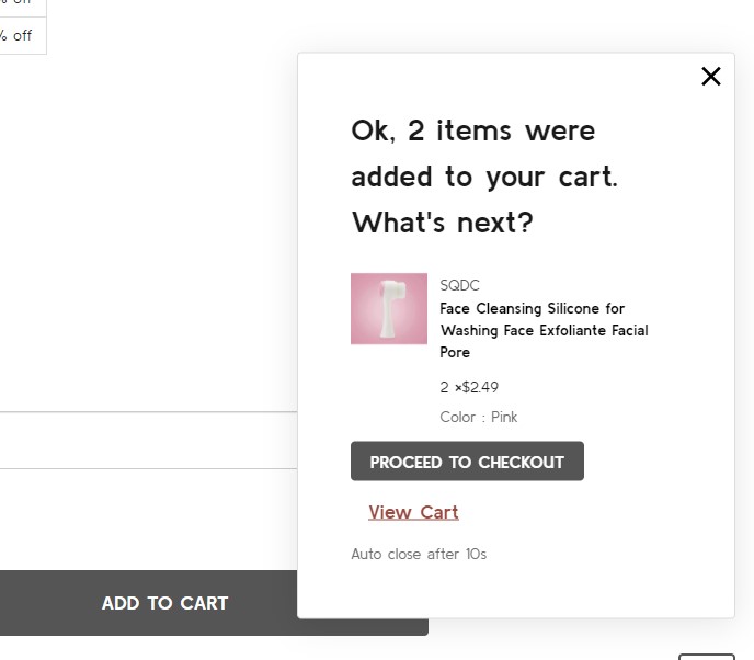
Customizing the popup displayed after product added to cart
In Page Builder > Theme Styles > Products > Popup after added to cart:
Default: Displaying the large popup.Mini: Displaying a smaller popup that has auto close.Hide: Not show any popup.
Mini added to cart popup:
Displaying Recently Viewed Products
Recently viewed products only display for logged-in customers.
To enable it, go to Page Builder > Theme Styles > Products > Show recently viewed select number of products to display.
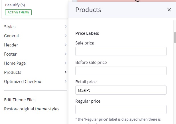
Customizing Price Labels
You can customize sale price label, before sale price label, retail price label or regular price label in Page Builder > Theme Styles > Products > Price Labels
Displaying product weight, dimensions on PDP
Go to Page Builder > Theme Styles > Products > Product Page.
- Tick Show product weight checkbox.
- Tick Show product dimensions checkbox.
Displaying product image thumbnails vertically or horizontally
Page Builder > Theme Styles > Products > Product Page, tick Show image thumbnails vertically to display product thumbnails vertically, otherwise it's displayed horizontally.
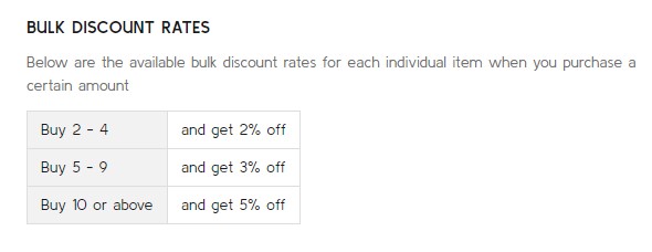
Displaying product bulk pricing inline in table
Instead of displaying bulk pricing in a popup modal, you can display it inline by going to Page Builder > Theme Styles > Products > Product Page, tick Show bulk price as table.
Displaying product custom fields in a separated tab
In Page Builder > Theme Styles > Products > Product Page:
- Tick Show custom fields in tab checkbox.
- Enter the tab title in the next Tab title box.
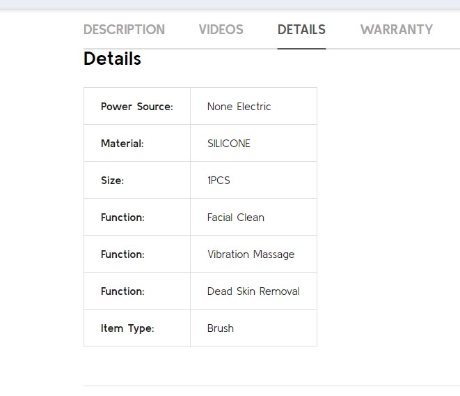
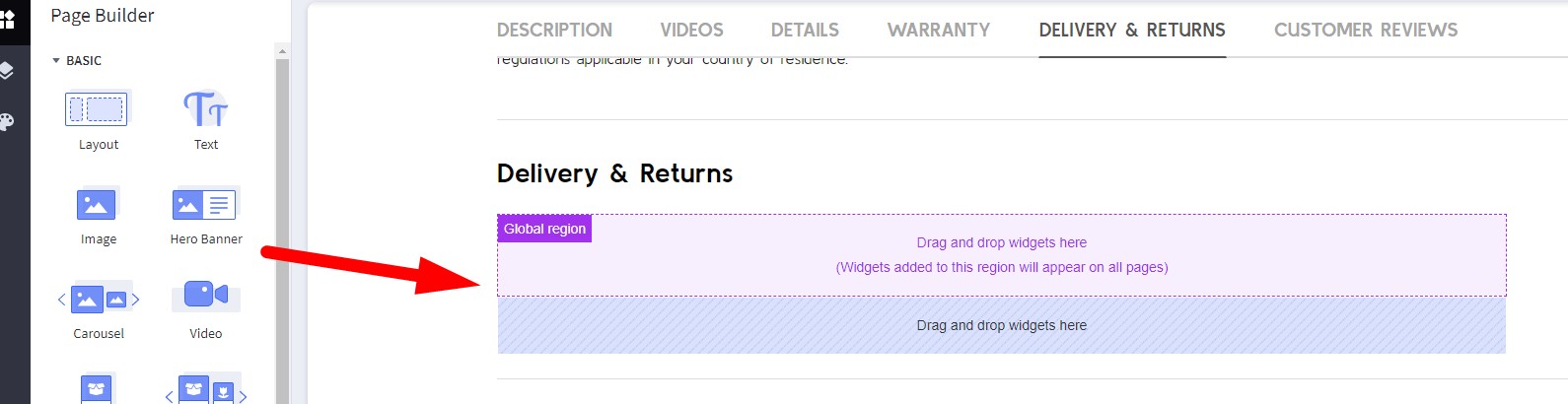
Displaying Delivery & Returns tab
In Page Builder > Theme Styles > Products > Product Page:
- Tick Show Delivery & Returns tab checkbox.
- Enter the tab title in the next Tab title box.
You can add specific content or global content using BC widgets:
Numbers of products, reviews, thumbnails
In Page Builder > Theme Styles > Products > Product Page:
- Number of Product Reviews: Specifying number of product reviews displayed.
- Number of Related Products: Specifying number of related products displayed.
- Number of Customers Also Viewed Products: Specifying number of customer also viewed products displayed.
- Number of visible thumbnails: Specifying number of images displayed in the product thumbnails slider.
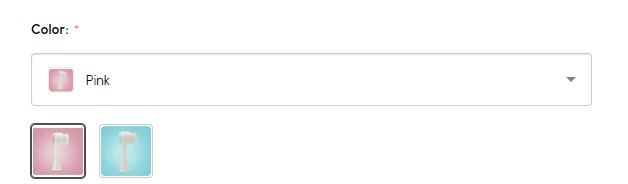
Displaying Swatch Options in the dropdown select box
In Page Builder > Theme Styles > Products > Swatch display type:
- Default (Square): Displaying the regular swatches by default.
- Dropdown: Displaying swatches in the dropdown select box.
- Dropdown + Square: Displaying swatches in the dropdown select box in addition to regular swatches.
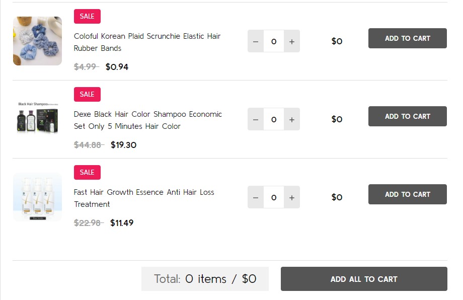
Displaying Frequently Bought Together Products
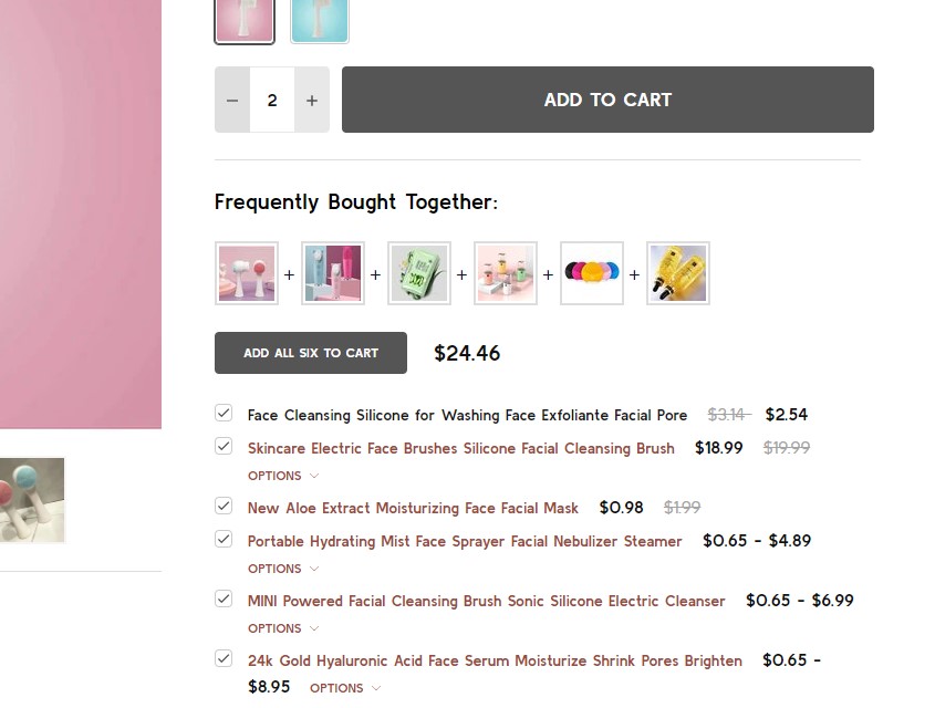
Enabling this feature in Page Builder > Theme Styles > Products > Frequently Bought Together, Select Position to display it.
- Load products from: Specifing products to display here.
Custom fields __alsobought: Specifying the relevant products in product custom fields with name__alsoboughtand value is the relevant product ID. For example: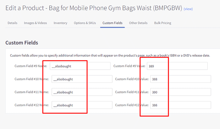
Related products: Pulling from the related products.Similar by biews: Pulling from customer also viewed products.- Auto select all items: Auto select or unselect all frequently bought together products.
- Thumbnail size: Specifying the thumbnail image size.
Configuring swatch dimension
In Page Builder > Theme Styles > Products > Swatch display type > Set Swatch size.
Sale badge, Condition badge and custom text badges
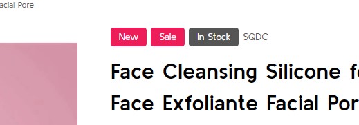
Displaying the sale badge in Page Builder > Theme Styles > Products > Product sale badges, tick Show sale badges.
- Label: Specifying the badge text.
- Text color: Specifying the badge text color.
- Background color: Specifying the badge background color
Displaying the condition badge in Condition badges, tick Show condition badges.
Displaying the condition badge in Custom badges, tick Enable custom badget from '__badge' custom field. Edit product, add custom field with name __badge and value is the badge text.
- Text color: Specifying the text color of the custom badge.
- Background color: Specifying the background color of the custom badge.
Configuring image sizes
In Page Builder > Theme Styles > Products > Image Sizes:
- Main product images: Specifying the main product image size displayed on PDP.
- Thumbnail image: Specifying the product thumbnail size.
- Zoomed image: Specifying the zoomed image size.
- Image in gallery view: Specifying product card image size.
Customizing Category Pages
Configuring the category pages in Page Builder > Theme Styles > Products > Category Page.
Products Display Type
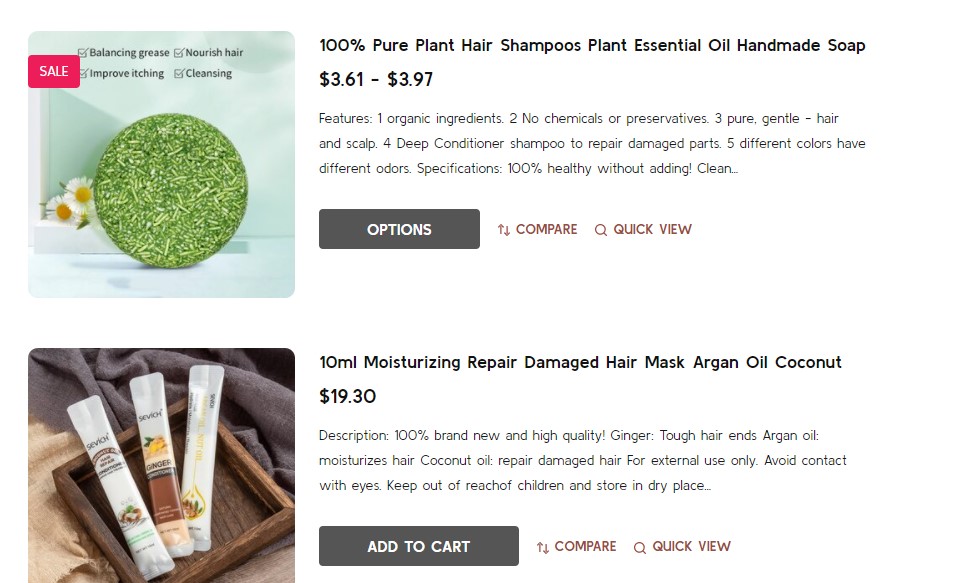
Theme supports displaying products in grid mode (2, 3, 4 or 6 products per row) or in list mode or bulk order mode. In Products display type, select the particular display mode.
- Show bulk order mode (if select, list mode replaced by bulk order mode): if selected, the Bulk Order layout mode will display instead of the regular list mode.
Grid 6 columns:
Bulk Order mode:
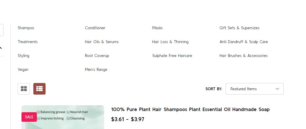
List mode:
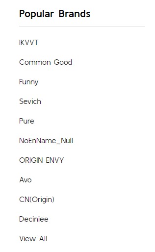
Displaying Shop by Brand
- Shop by Brand: Specifing number of popular brands to display.
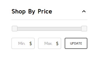
Displaying Price Slider
- Shop by Price:
Slider: Displaying the price slider.List: Displaying price list.Hide.
Display Bulk Order layout
To display this bulk order layout, select Products display type = List, and tick Show bulk order mode (if select, list mode replaced by bulk order mode).
Display contextual search
This feature allows searching products within the current category and the current selected filter.
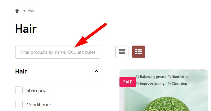
Select Show quick search in category = Show to enable it.
- + Show results in descendent categories: if selected, it also displays results in the descentent categories.
Display subcategory image thumbnails
This feature allow displaying subcategory thumbnails before products.
Select Show subcategory thumbnails to enable it.
Common Settings
- Number of products per page: Specifying number of products to display per page.
- Show category image: Displaying the catgory image or not.
- Show category description on AMP page: Displaying category description on AMP category page or not. If the category content contains images, the AMP page could be invalid. It's recommended to turn off this option.
Customizing Brand Page & Search Page
Configuring the brand page in Page Builder > Theme Styles > Products > Brand Page.
- Number of brands per page: Specifying number of brands to display per page.
- Number of products per page: Specifying number of products to display per page.
- Brand image in gallery view: Specifying the brand card image size.
- Brand image in brand page: Specifying the large image size displayed on the brand page.
Configuring the search results page in Page Builder > Theme Styles > Products > Search results.
- Number of products per page: Specifying number of products to display on the search results page.